Tern is a terminal where programs can draw native UI instead of text. A plugin block, or any CLI that speaks its Surface Protocol, returns a tree of nodes like card, table, chart or message, and Tern lays it out, themes it and animates it. The Elements reference lists 74 kinds. I wanted to see all of them at once, in my own theme, behaving the way they would in a real tool. So I built a block that draws every one.
The code is a public gist: Tern Elements Showcase. Clone it and link it:
git clone https://gist.github.com/0f305b68c6803d1b34e98db07b62f414.git tern-showcase
tern plugin link tern-showcase
Then run Open Elements Showcase from the palette. [ and ] switch between families.
How it is built
A Tern plugin is a folder with a plugin.toml and Luau files. The block lives in the host half, which runs in the session daemon, so it survives closing the window. Each block has three handlers that matter: init returns the state, view returns a node tree, and event and key change the state. After every handler Tern calls view again, diffs the tree by node id and sends only the changes. You never push a frame yourself.
The shell is about 200 lines. It draws a head row, a tabs strip with one tab per family and a key legend in the dock, and it routes events and keys to the active page. Each family is one module that returns a Page table with view, event, key and a once-a-second tick. Every kind gets its own section keyed by its name, so the section for table on the Data page always has the id main.data.table.
Nine agents wrote the nine pages in parallel against that contract. Each one read its family’s docs, wrote the page, ran luau-lsp against the tern.d.luau that tern plugin types generates, then reloaded the plugin in my running Tern and looked at screenshots of its own sections. The finished plugin is about 9,100 lines of Luau, most of it sample data.
Things I learned
- The program owns every text field.
editor,inputandotpnever edit themselves. Keys go to yourkeyhandler, you updatetextandcursorin state, and the next view redraws them. Focus is a raw frame op,cx:frame({ { "focus", id } }), because the diff never sends it. - One broken page breaks the whole block. A syntax error stops the plugin from loading, and the open block pane exits with status 1. A duplicate sibling
keyis quieter: Tern rejects that view and keeps the last good one. Both happened while nine agents edited files at once. Running the type check before each reload fixed it. - A region root is never drawn.
main = ui.text(...)shows nothing. Every region needs a container, and ids in thelayerregion start atlayer.<key>, not under your page. - Use
tern.now()for durations only. It returns monotonic milliseconds, soos.dateon it gives nonsense. The status bar clock shows time since the page loaded. - Scripting the window works well.
tern ctl shot,dump,pick,clickandwheeldrive the live window. Every image below is a crop of ashot, aligned with the section’sdumprect. One catch:wheelscrolls whatever is under the pointer, and alistwith a height cap eats the scroll. I had topicka point outside inner scrollers first. - Some things don’t work yet. In Tern 0.9.9,
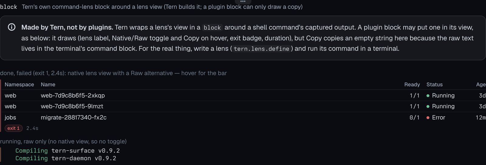
colspanon aneltdsets the attribute but draws one column.wrap = "char"ontextlooks the same as"word".toneon anelonly setsdata-tone, so without CSS it adds no color. A plugin cannot make a realblocknode, because Tern builds those around a command’s lens view, so that section explains this and draws a copy.
The elements
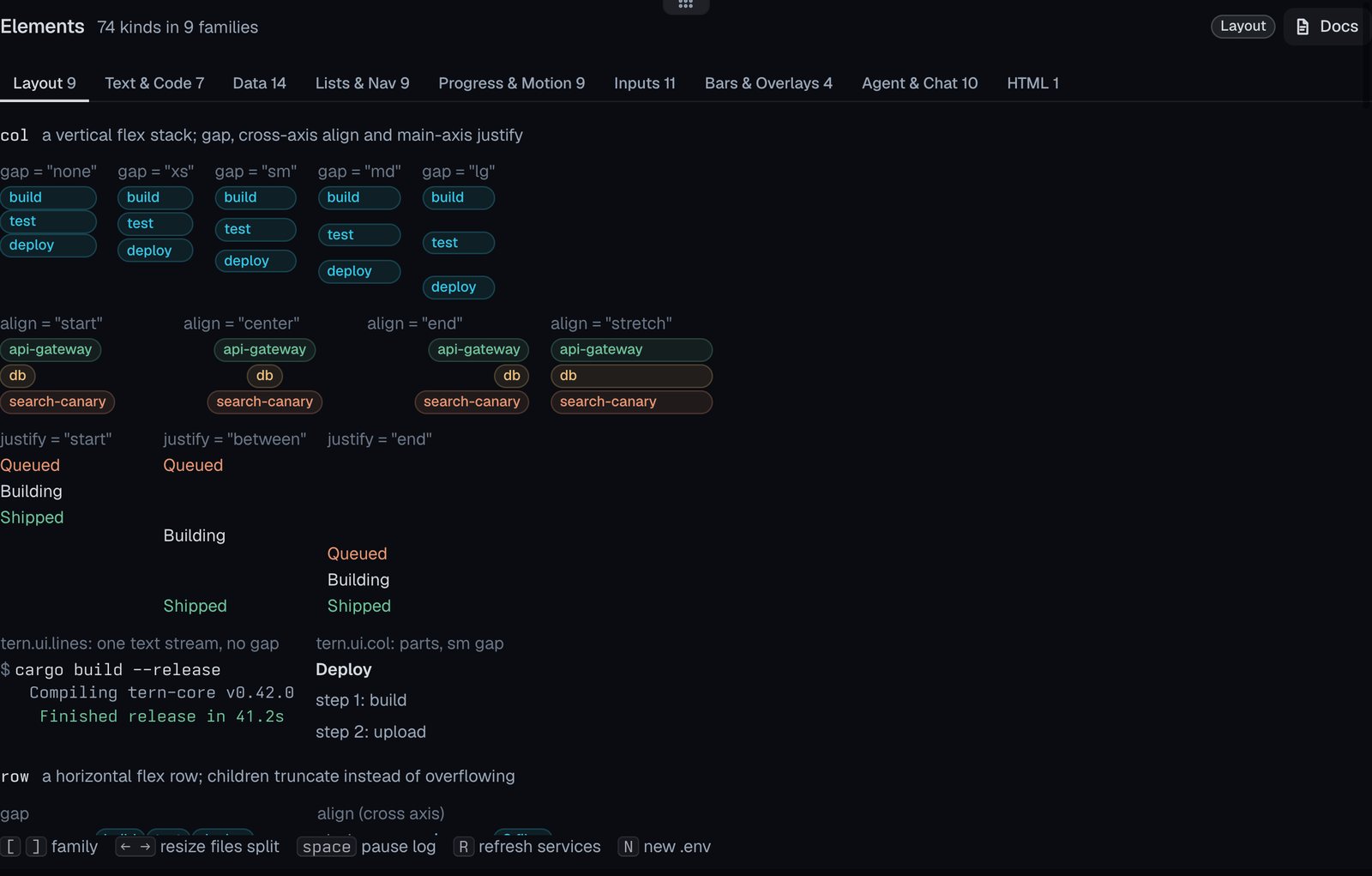
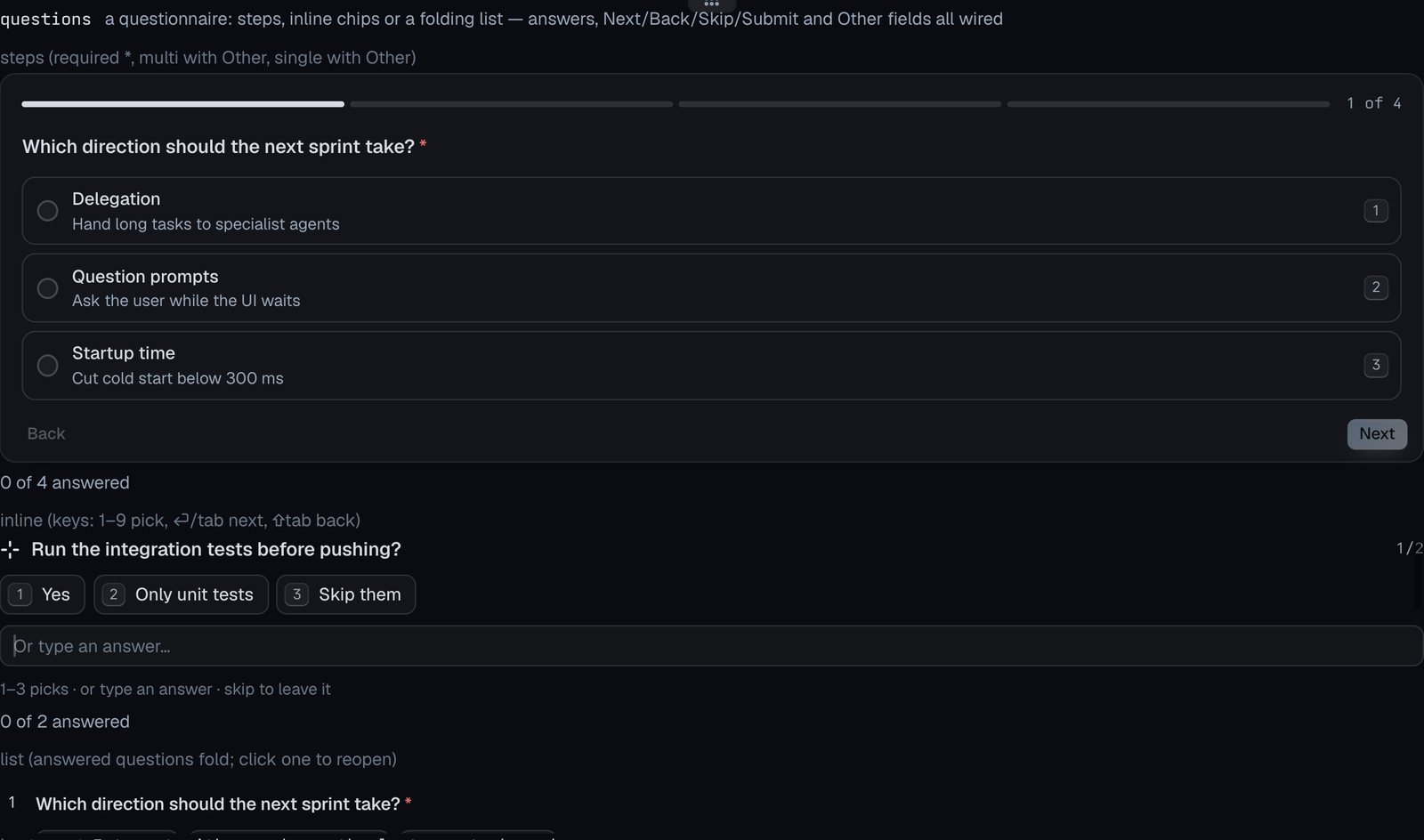
Every screenshot below is from the live block in Tern’s dark theme. Interactive kinds respond in the real block: the table sorts and picks rows, the questionnaire steps through its questions, the inputs take typing, and the overlays open and close.
Layout
Docs: Layout
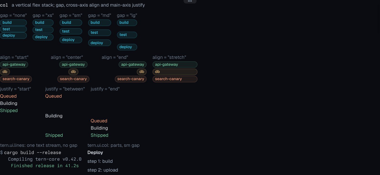
col
A vertical flex stack; gap, cross-axis align and main-axis justify.
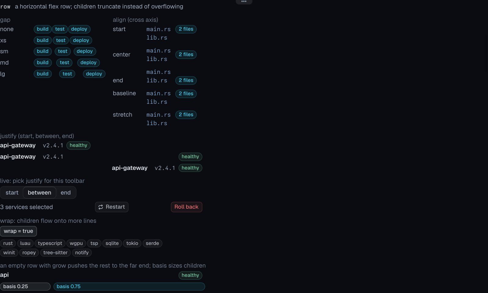
row
A horizontal flex row; children truncate instead of overflowing.
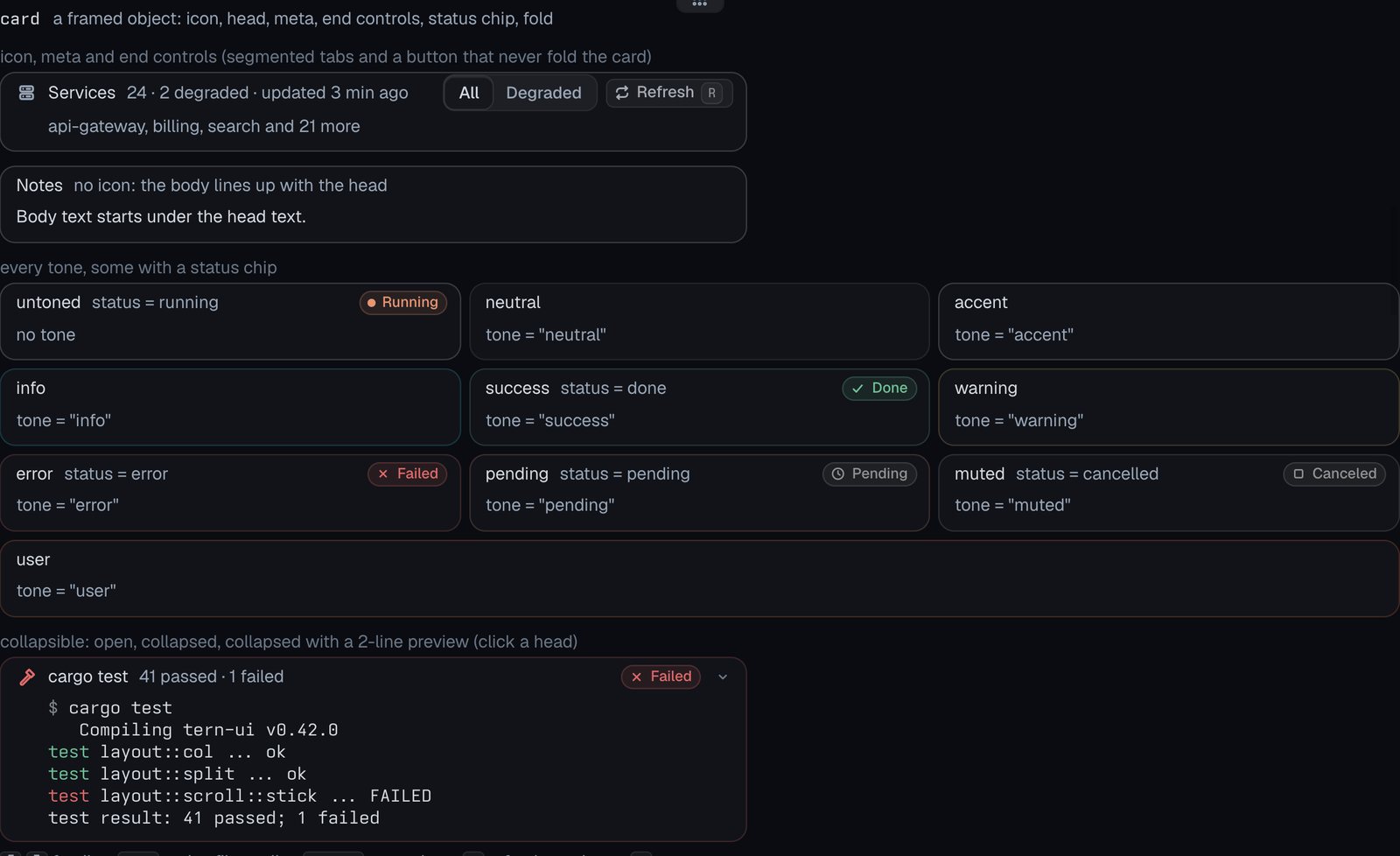
card
A framed object: icon, head, meta, end controls, status chip, fold.
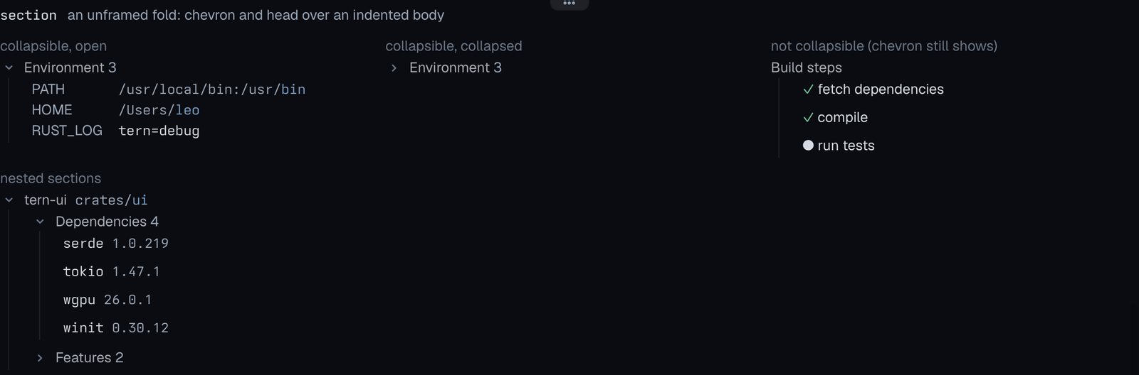
section
An unframed fold: chevron and head over an indented body.
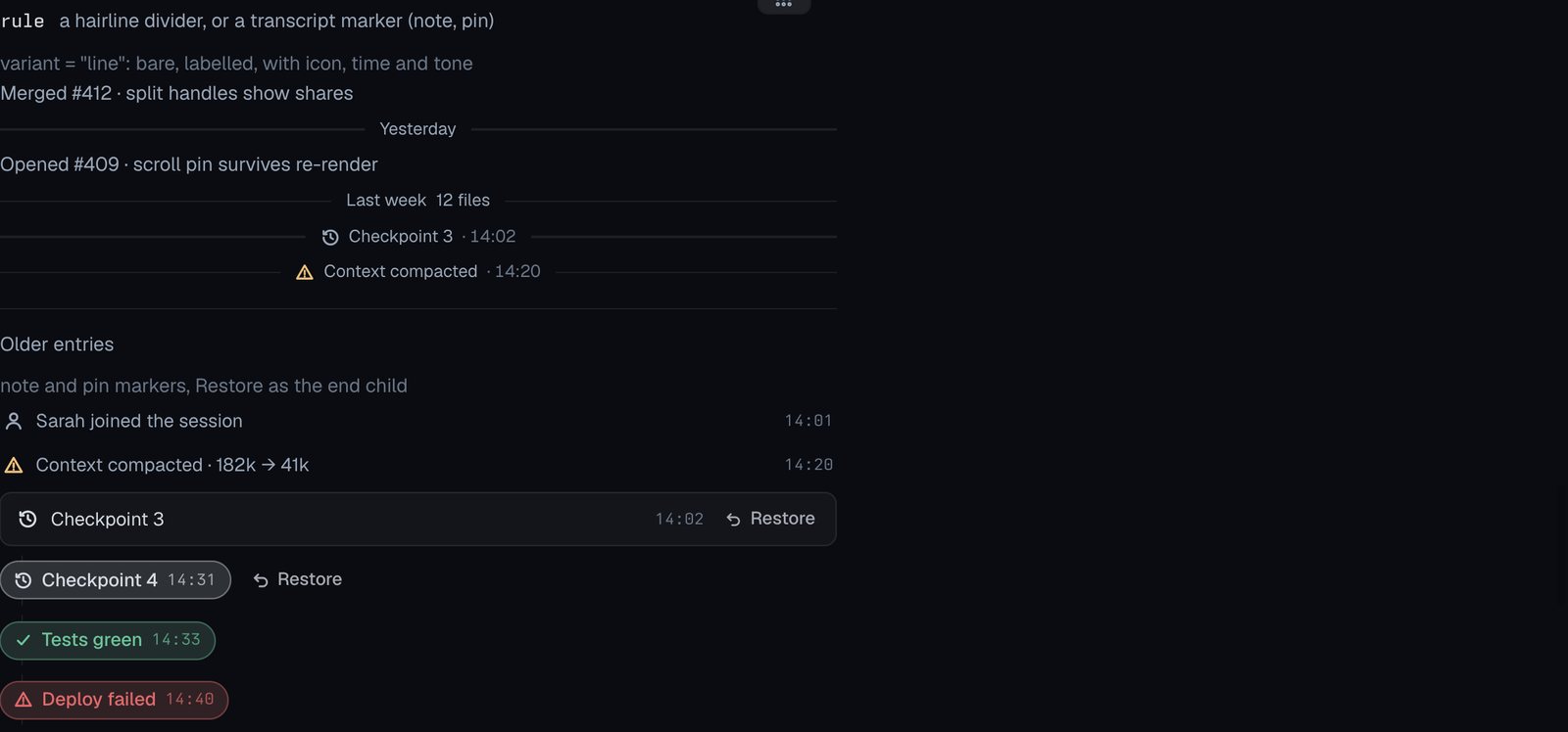
rule
A hairline divider, or a transcript marker (note, pin).
spacer
Fixed vertical space: none 0, xs 2px, sm 6px, md 12px, lg 20px.

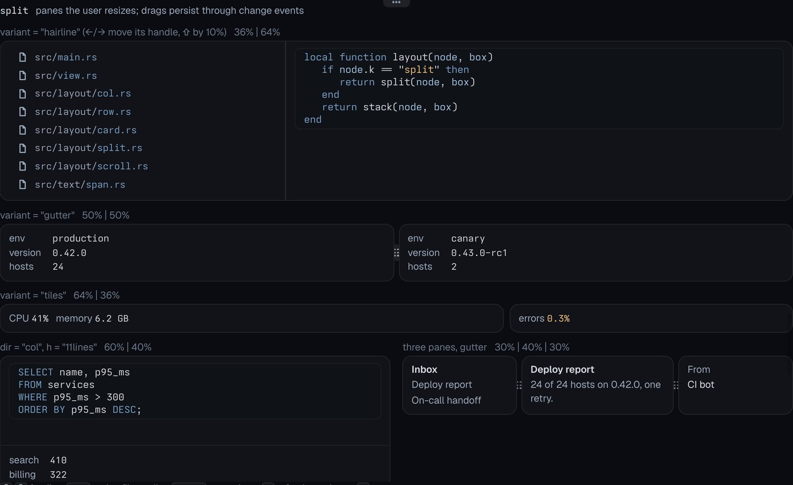
split
Panes the user resizes; drags persist through change events.
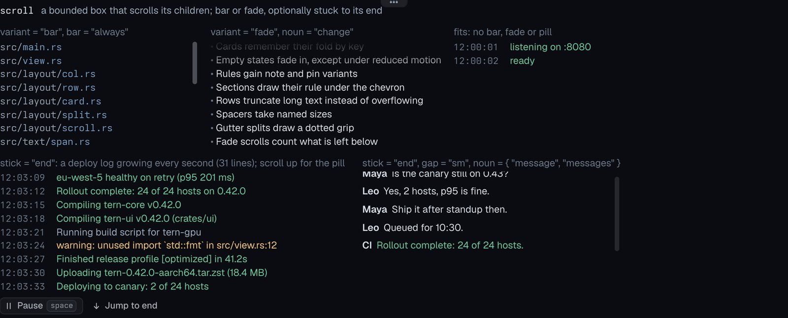
scroll
A bounded box that scrolls its children; bar or fade, optionally stuck to its end.
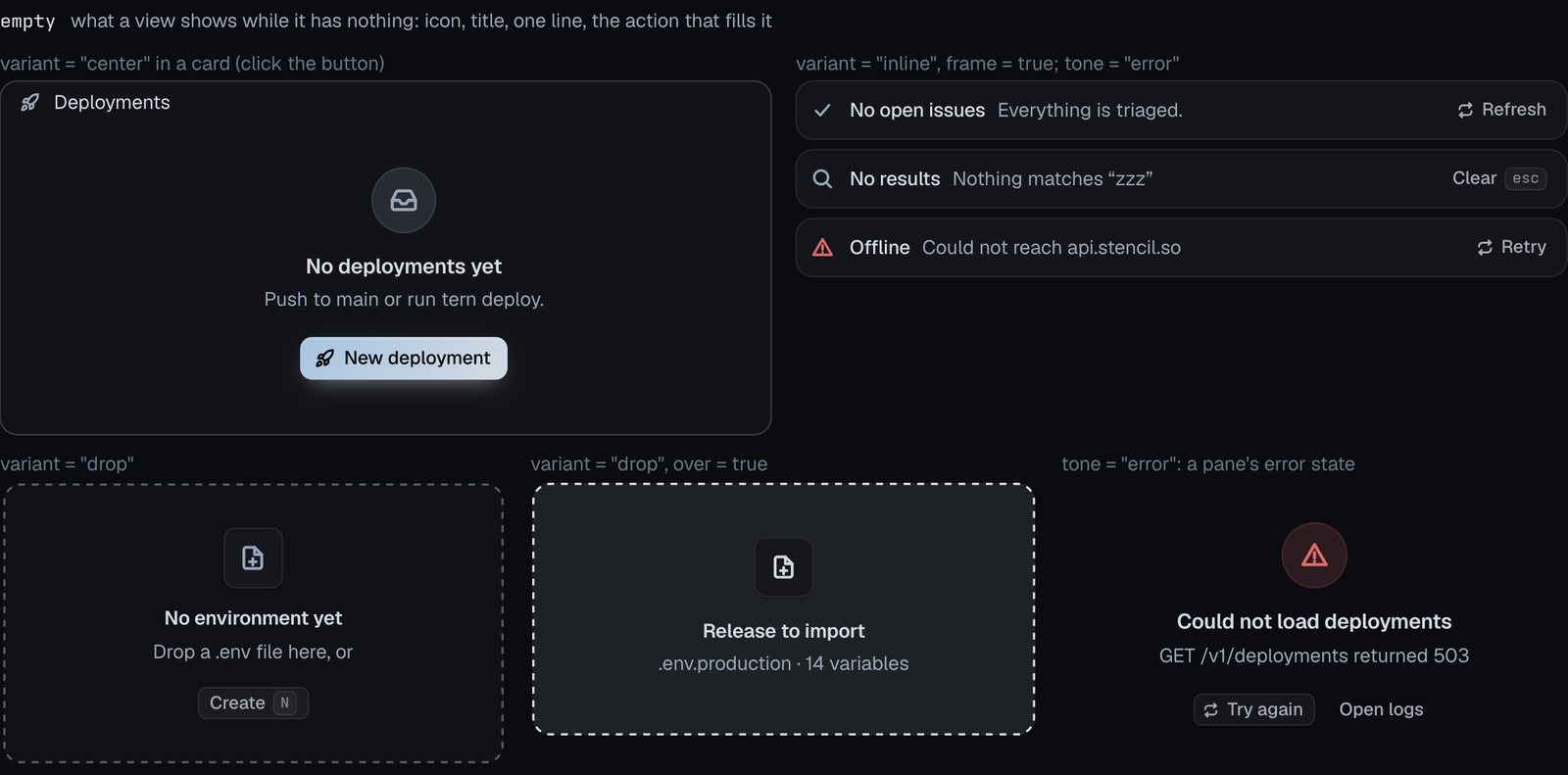
empty
What a view shows while it has nothing: icon, title, one line, the action that fills it.
Text and code
Docs: Text and code
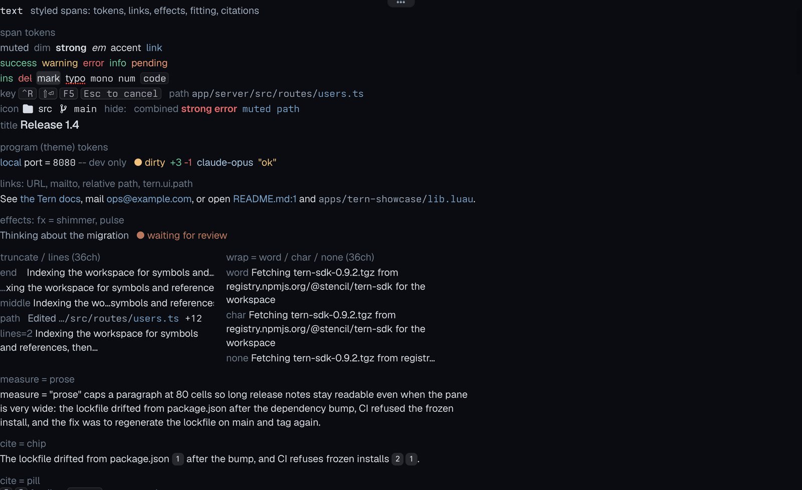
text
Styled spans: tokens, links, effects, fitting, citations.
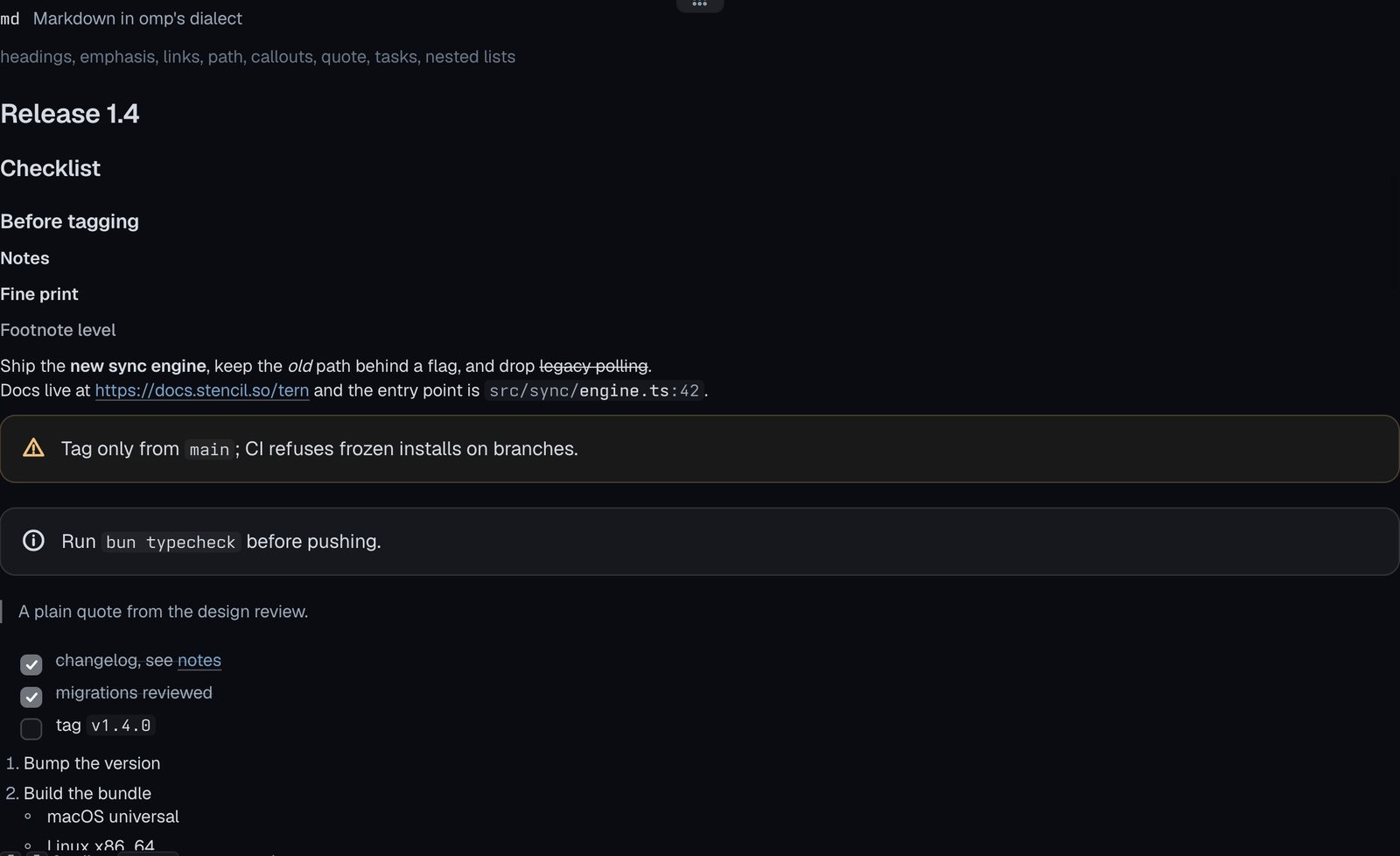
md
Markdown in omp’s dialect.
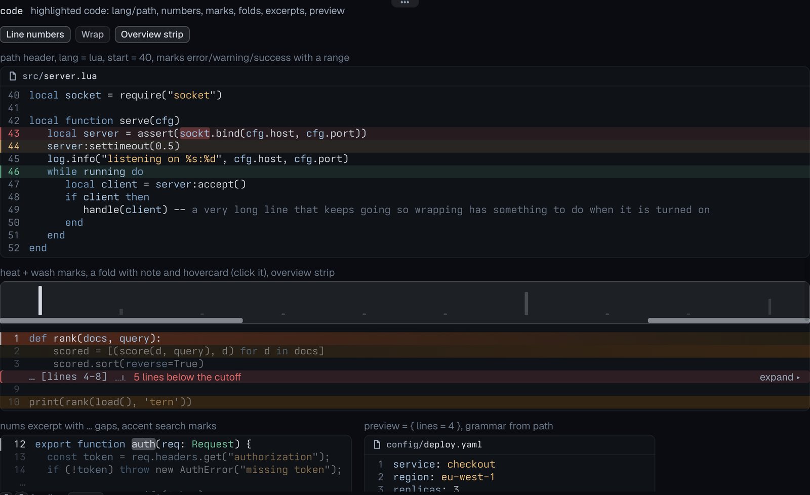
code
Highlighted code: lang/path, numbers, marks, folds, excerpts, preview.
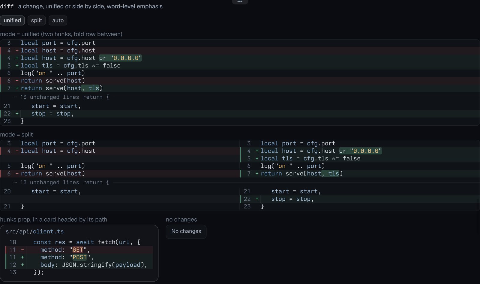
diff
A change, unified or side by side, word-level emphasis.
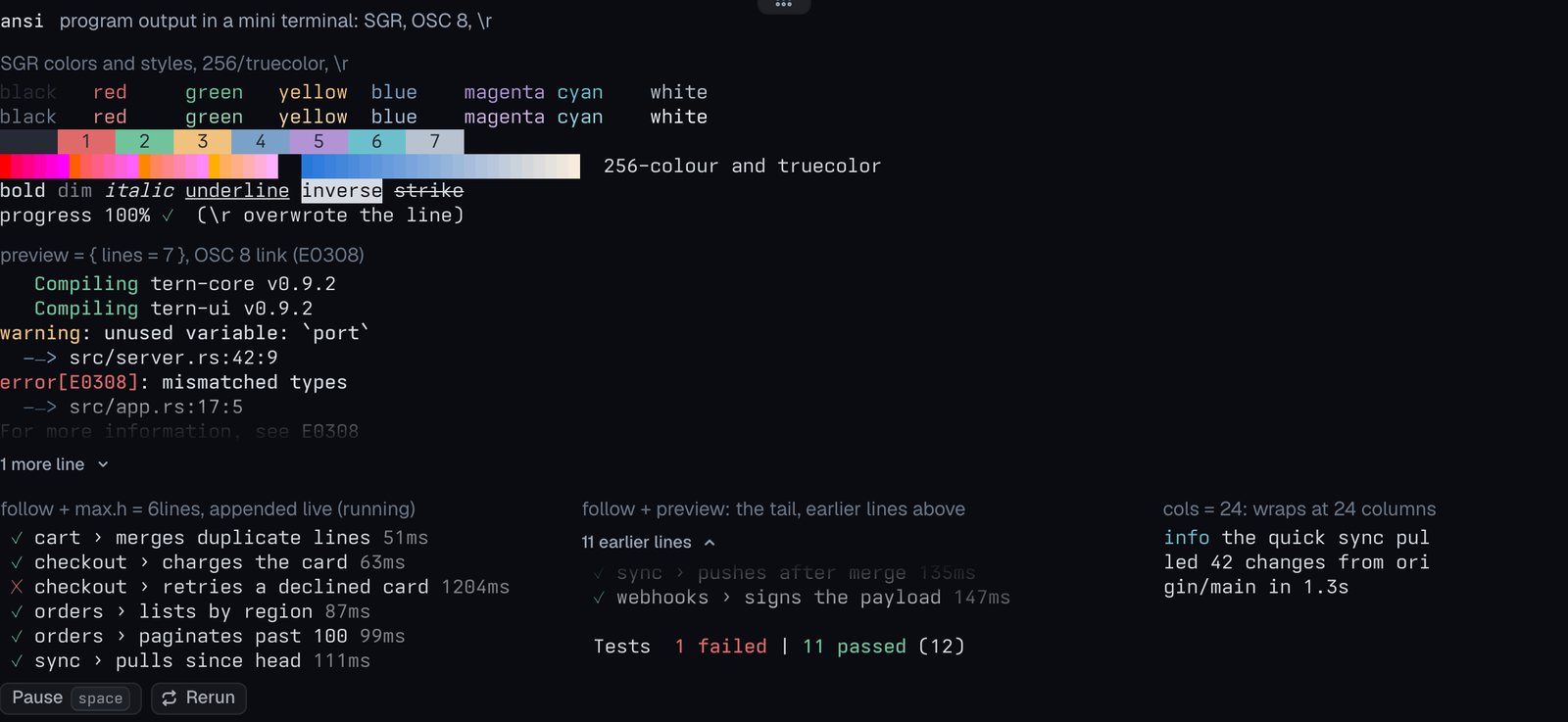
ansi
Program output in a mini terminal: SGR, OSC 8, \r.
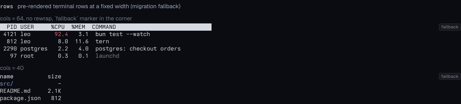
rows
Pre-rendered terminal rows at a fixed width (migration fallback).
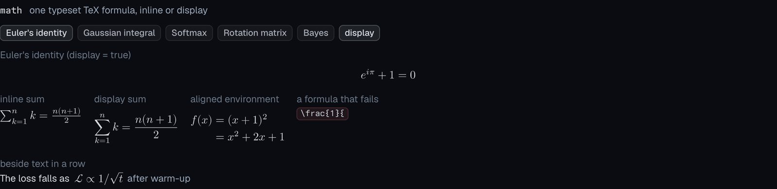
math
One typeset TeX formula, inline or display.
Data
Docs: Data
kv
An aligned key/value grid, or one inline line.

stats
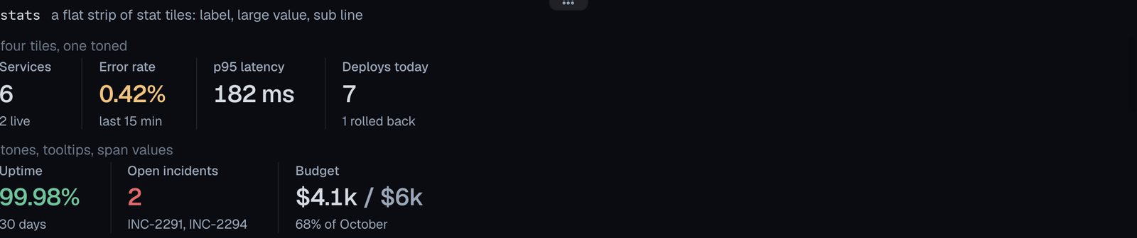
A flat strip of stat tiles: label, large value, sub line.
table
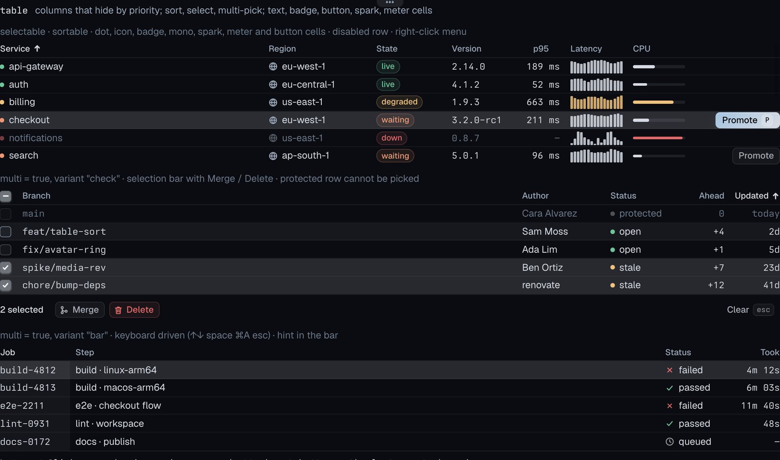
Columns that hide by priority; sort, select, multi-pick; text, badge, button, spark, meter cells.
tree
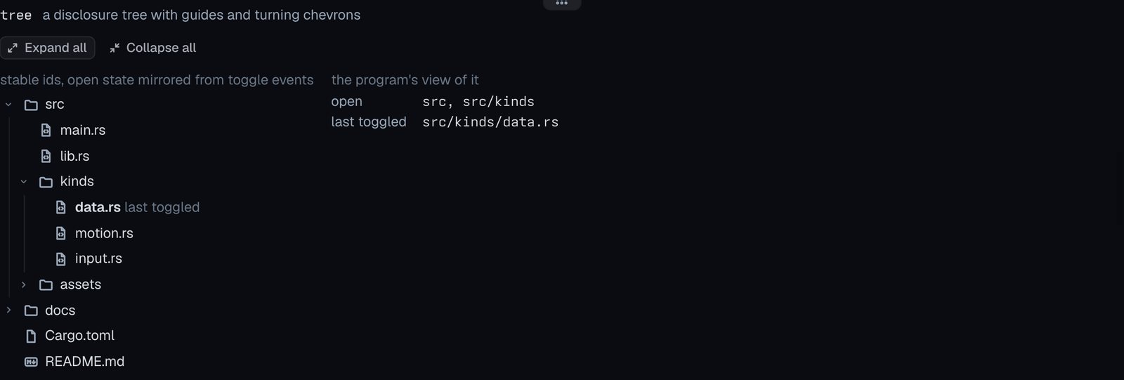
A disclosure tree with guides and turning chevrons.
json
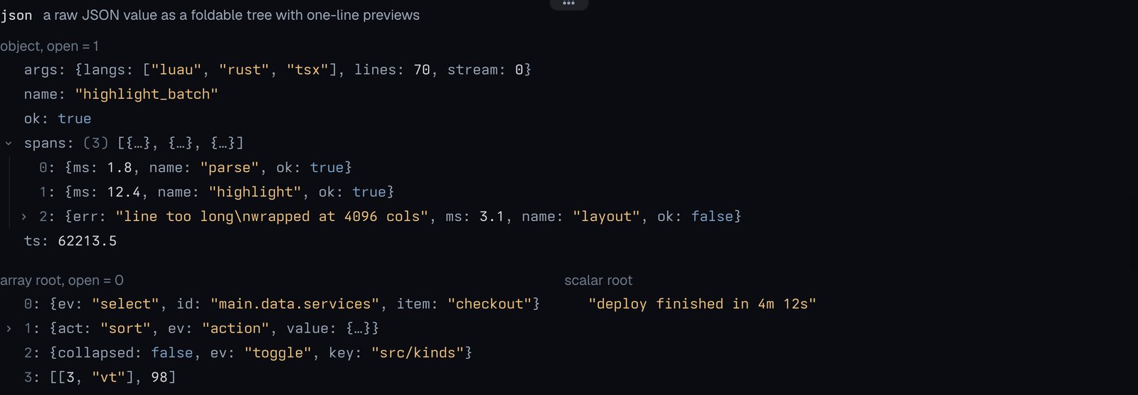
A raw JSON value as a foldable tree with one-line previews.
badge
A tone-tinted pill.

kbd
Keycaps with platform glyphs.

icon
One icon from Tern’s set; hover any icon for its name.
avatar
A person’s, bot’s or provider’s mark, with a status dot.

avatars
An overlapping stack with a +N overflow chip and a label.

image
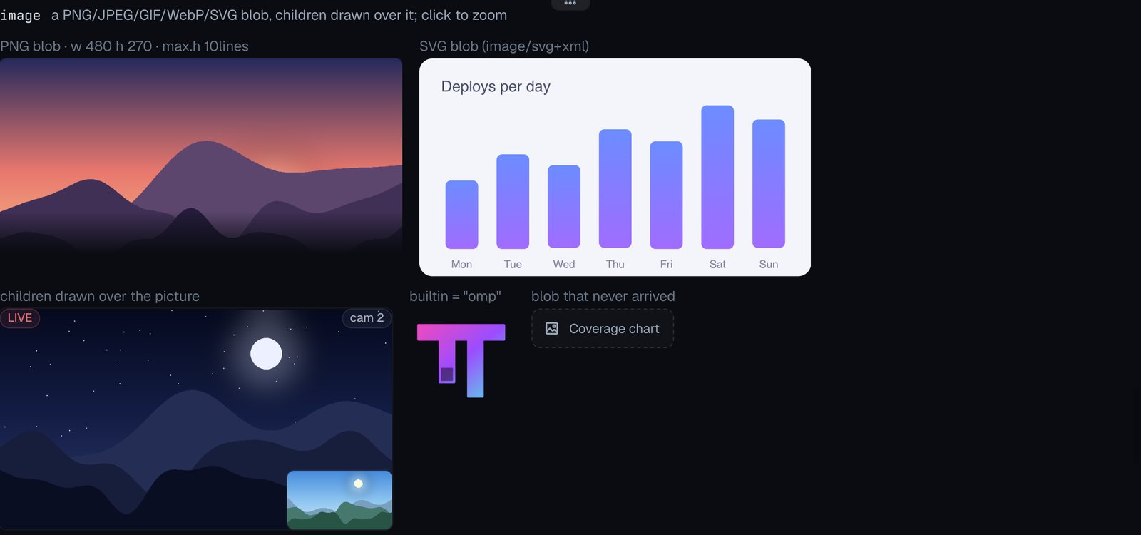
A PNG/JPEG/GIF/WebP/SVG blob, children drawn over it; click to zoom.
media
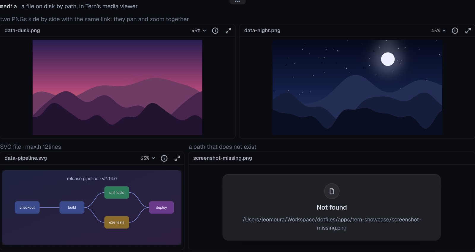
A file on disk by path, in Tern’s media viewer.
carousel
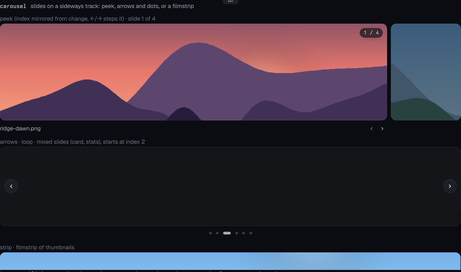
Slides on a sideways track: peek, arrows and dots, or a filmstrip.
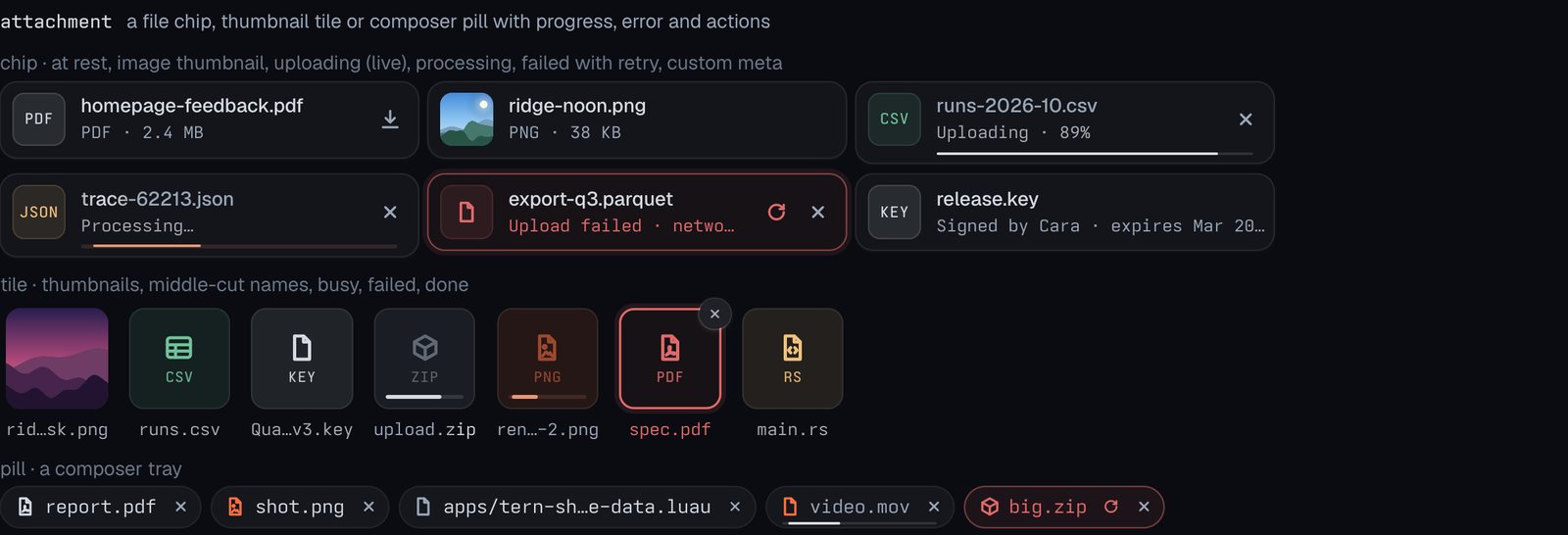
attachment
A file chip, thumbnail tile or composer pill with progress, error and actions.
Lists, menus and navigation
Docs: Lists, menus and navigation
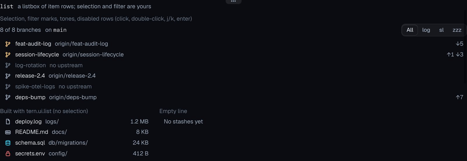
list
A listbox of item rows; selection and filter are yours.
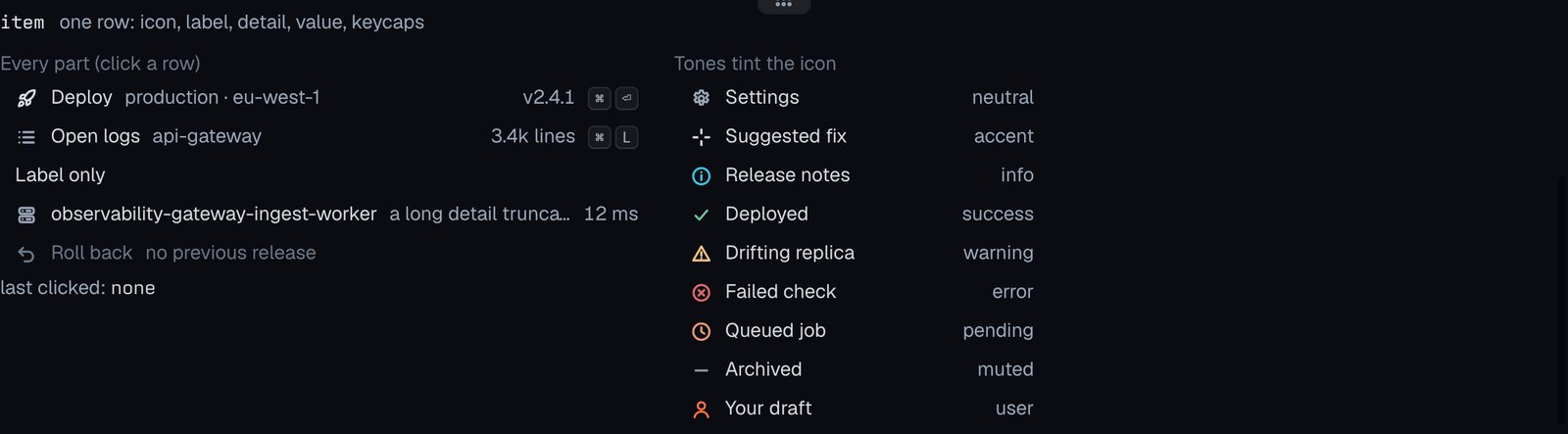
item
One row: icon, label, detail, value, keycaps.
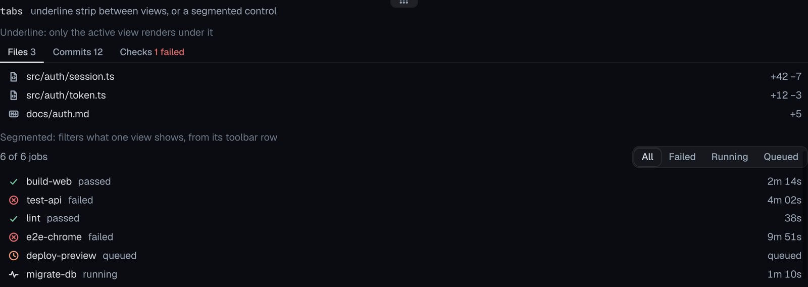
tabs
Underline strip between views, or a segmented control.
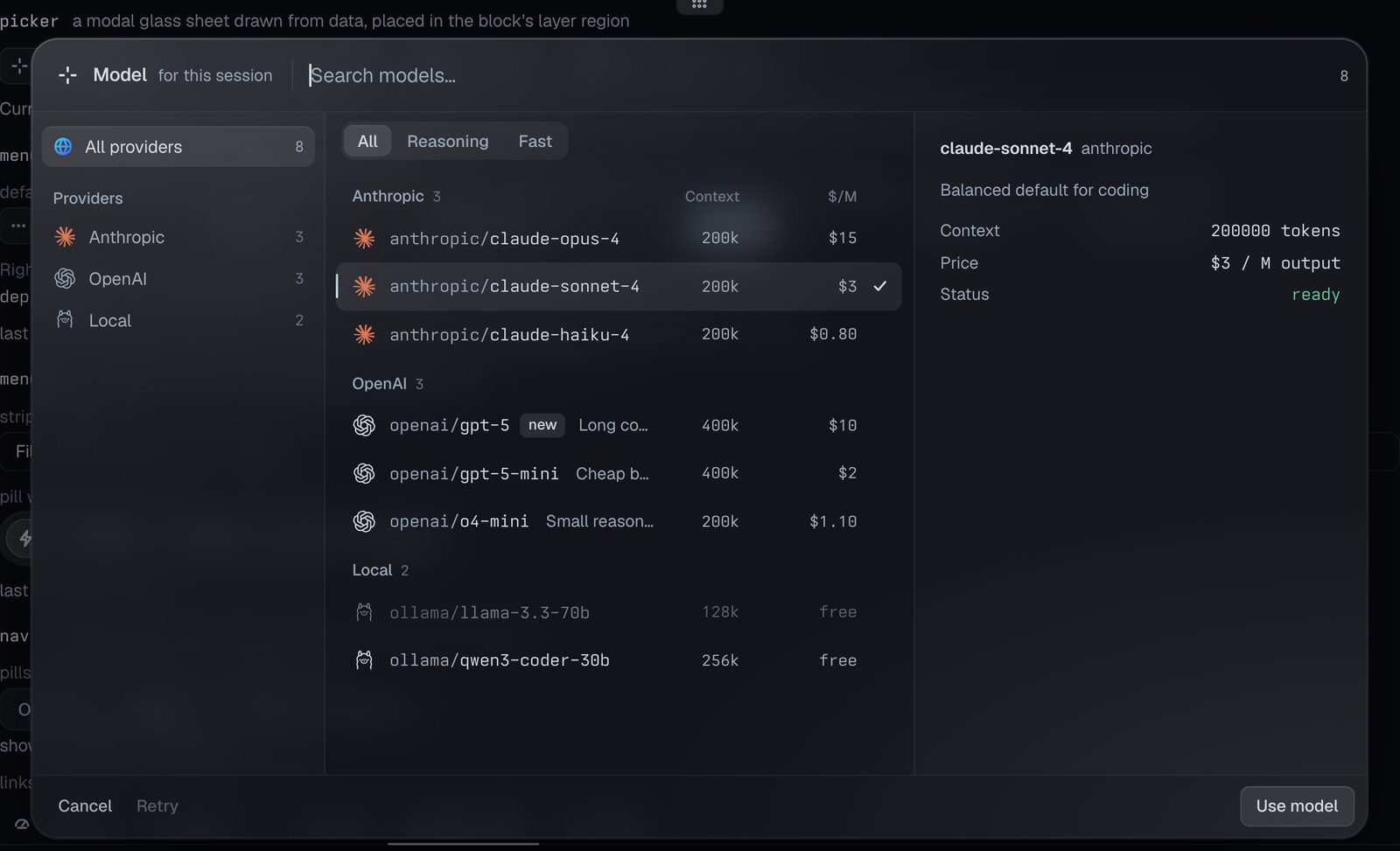
picker
A modal glass sheet drawn from data, placed in the block’s layer region.

The picker open in the block’s layer: providers on the left, grouped rows with columns, and a detail pane.
menu
A button that opens a dropdown of commands.

menubar
An app’s menus in a row: quiet strip or floating pill.

nav
An app’s sections; items with sub-items open a menu or panel.

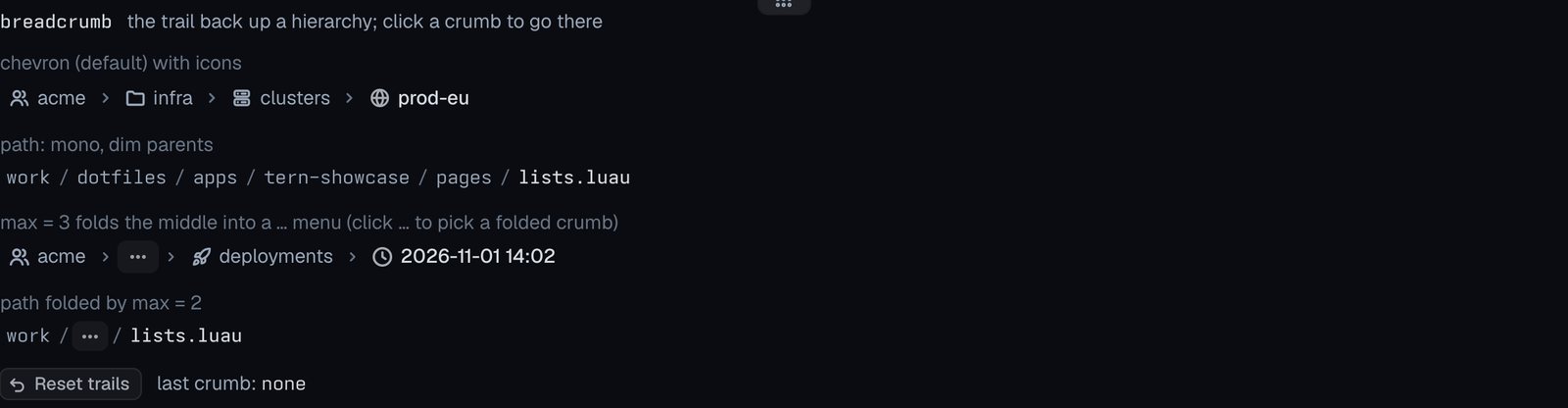
breadcrumb
The trail back up a hierarchy; click a crumb to go there.
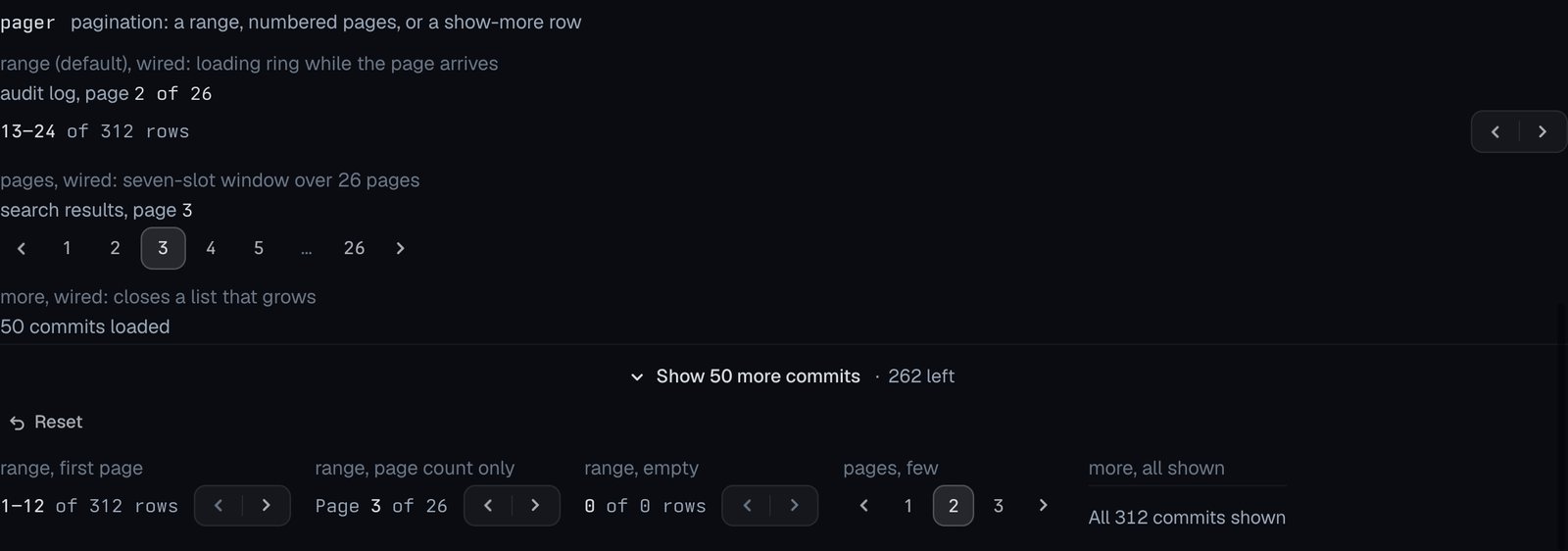
pager
Pagination: a range, numbered pages, or a show-more row.
Progress and motion
Docs: Progress and motion
spinner
An activity indicator with an optional label; style and tone.

shimmer
Text with a band of light sweeping across it.

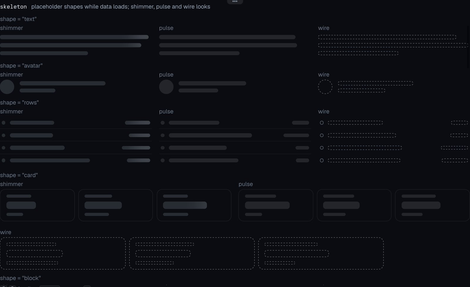
skeleton
Placeholder shapes while data loads; shimmer, pulse and wire looks.
elapsed
A live timer or countdown; short and clock formats.

rate
A number that eases to each new value (new target every second).

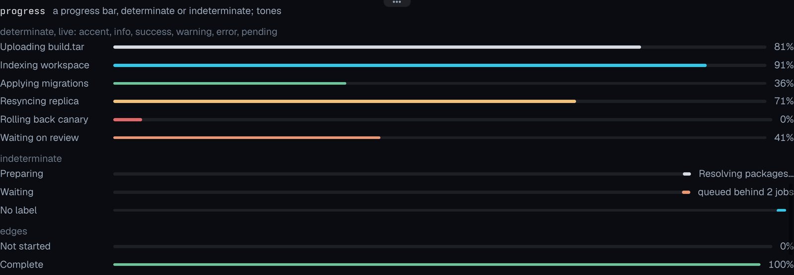
progress
A progress bar, determinate or indeterminate; tones.
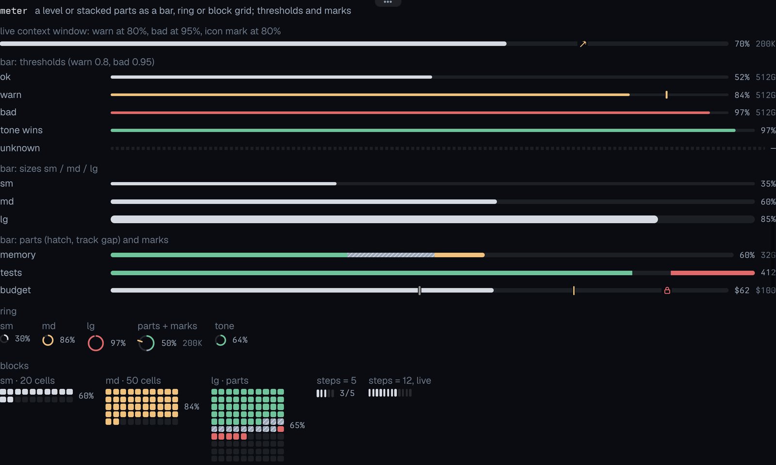
meter
A level or stacked parts as a bar, ring or block grid; thresholds and marks.
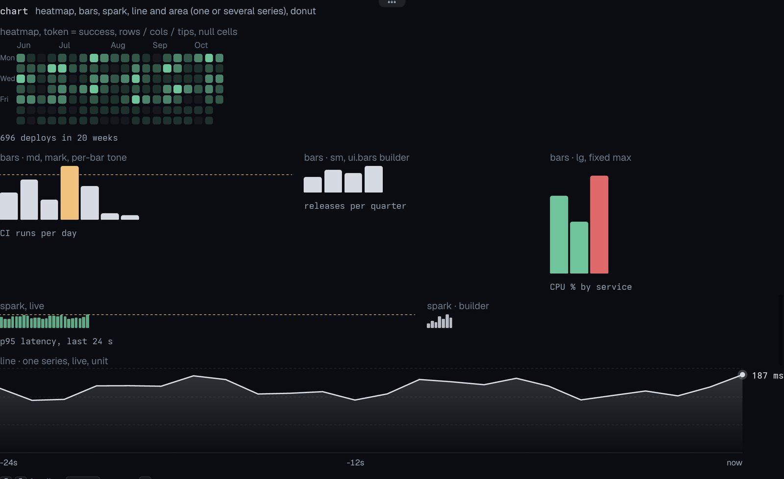
chart
Heatmap, bars, spark, line and area (one or several series), donut.
effort
Omp’s thinking-effort ring, one sixth per level; fire at max.

Inputs and buttons
Docs: Inputs and buttons
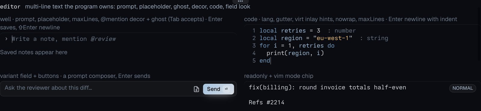
editor
Multi-line text the program owns: prompt, placeholder, ghost, decor, code, field look.
input
One-line field: well look, or field look with addons.
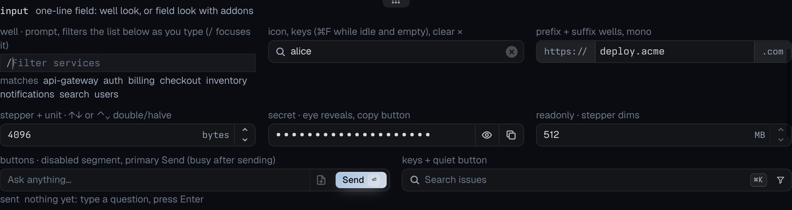
button
Tern’s button: variants, sizes, icons, keycaps, on, busy, disabled.

buttons
Buttons drawn as one control: joined, split, toolbar.

select
A value picked from a menu: field, quiet, searchable combobox.

switch
An on/off setting: settings row, compact, segment.

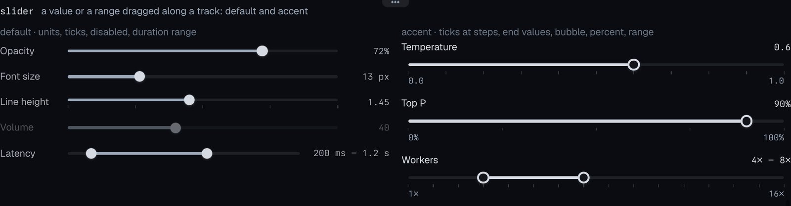
slider
A value or a range dragged along a track: default and accent.
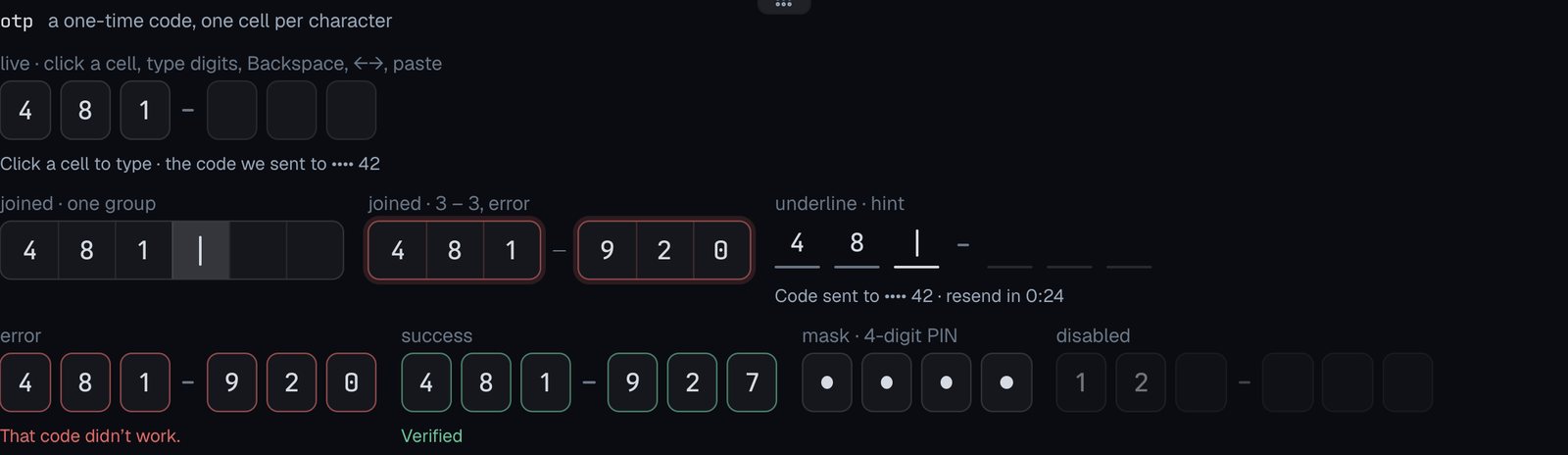
otp
A one-time code, one cell per character.
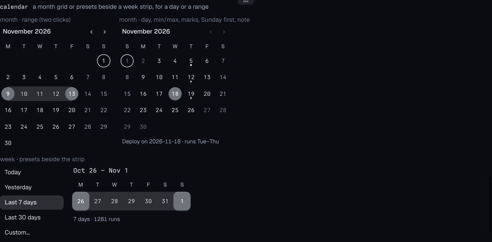
calendar
A month grid or presets beside a week strip, for a day or a range.
date
A date field that opens a month calendar.

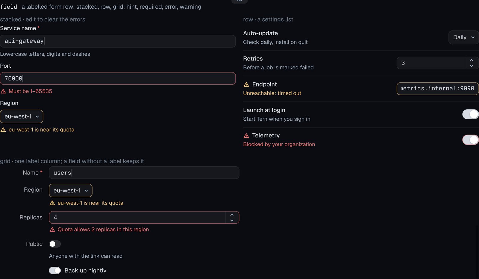
field
A labelled form row: stacked, row, grid; hint, required, error, warning.
Bars, toasts and overlays
Docs: Bars, toasts and overlays
status
A 24 px strip; right-side segs pinned right, low priority drops first.

seg
One segment: icon, spans, tone, children, optional click.

toast
A transient notice in the window’s toast layer; the node draws nothing.

overlay
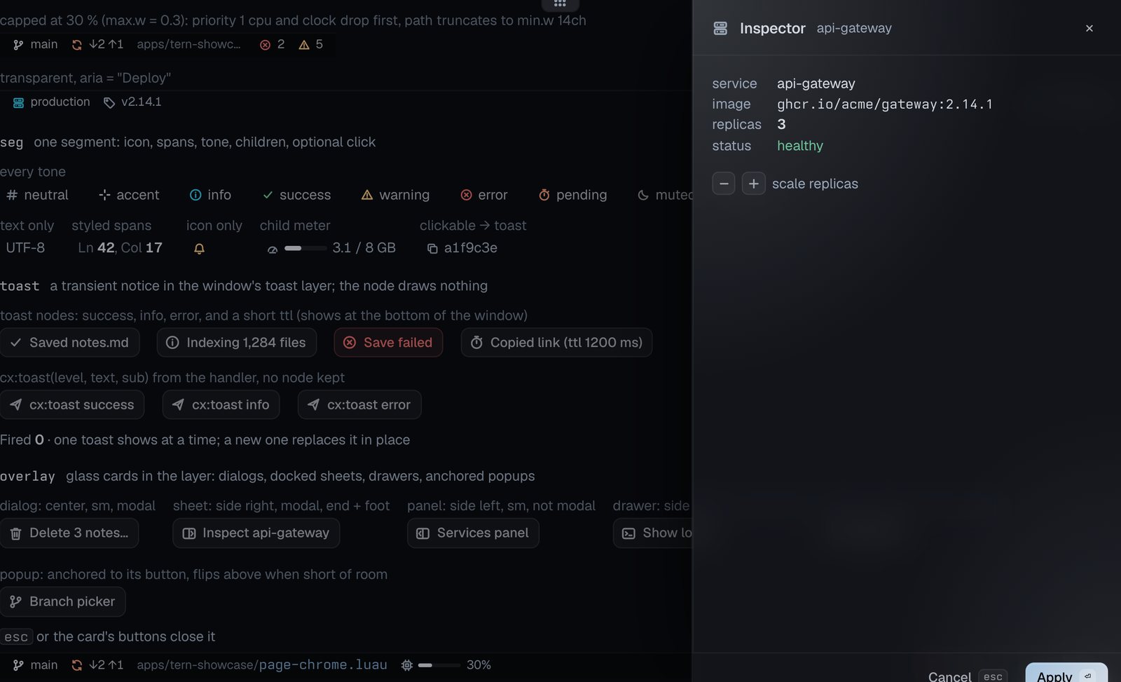
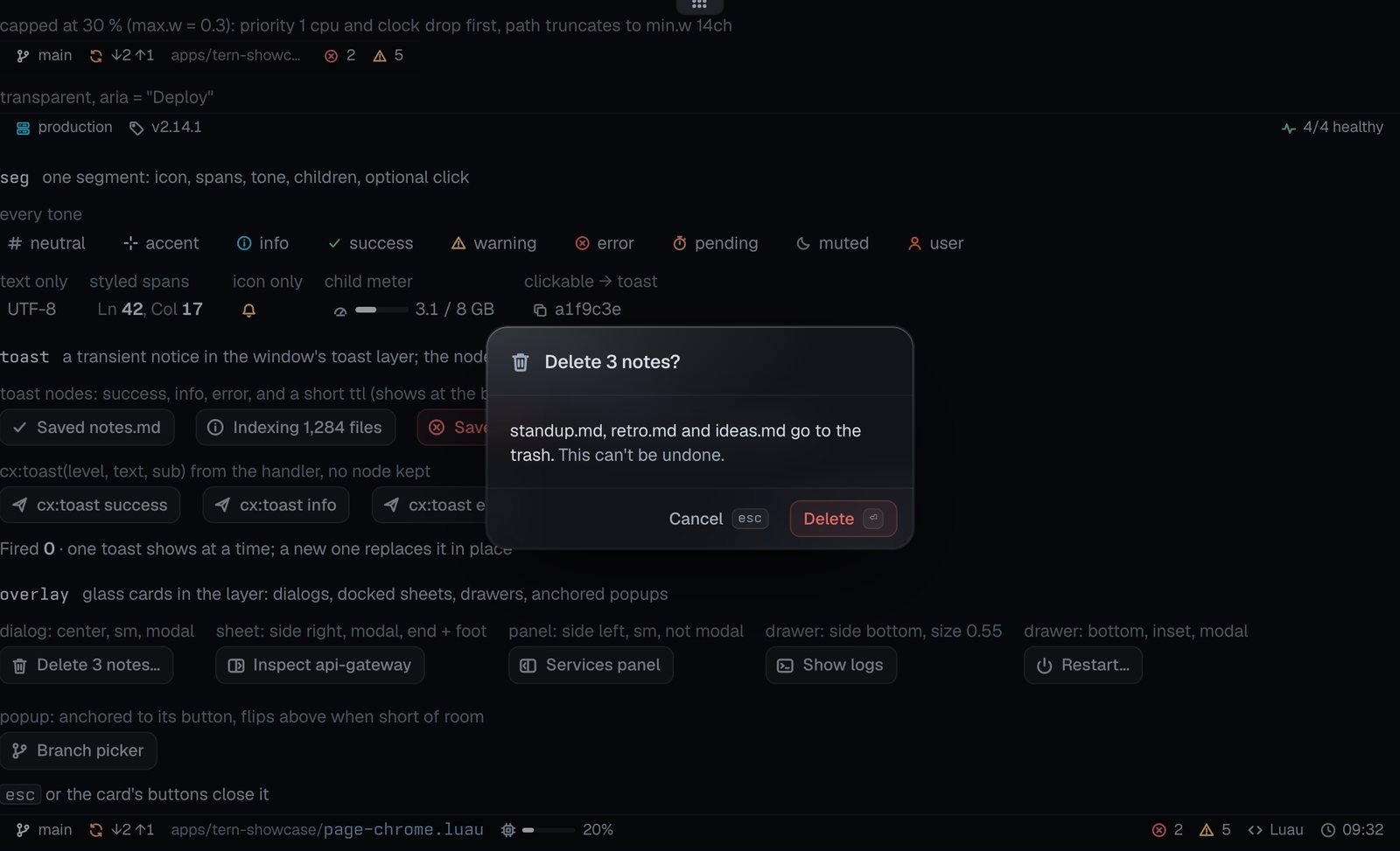
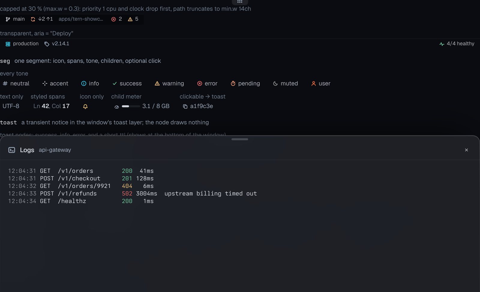
Glass cards in the layer: dialogs, docked sheets, drawers, anchored popups.

A right-side inspector sheet with a head, a kv body and Cancel/Apply in the foot.
A small modal dialog with keycapped buttons.
A bottom drawer holding ANSI log output.
Agent, chat and task kinds
Docs: Agent, chat and task kinds
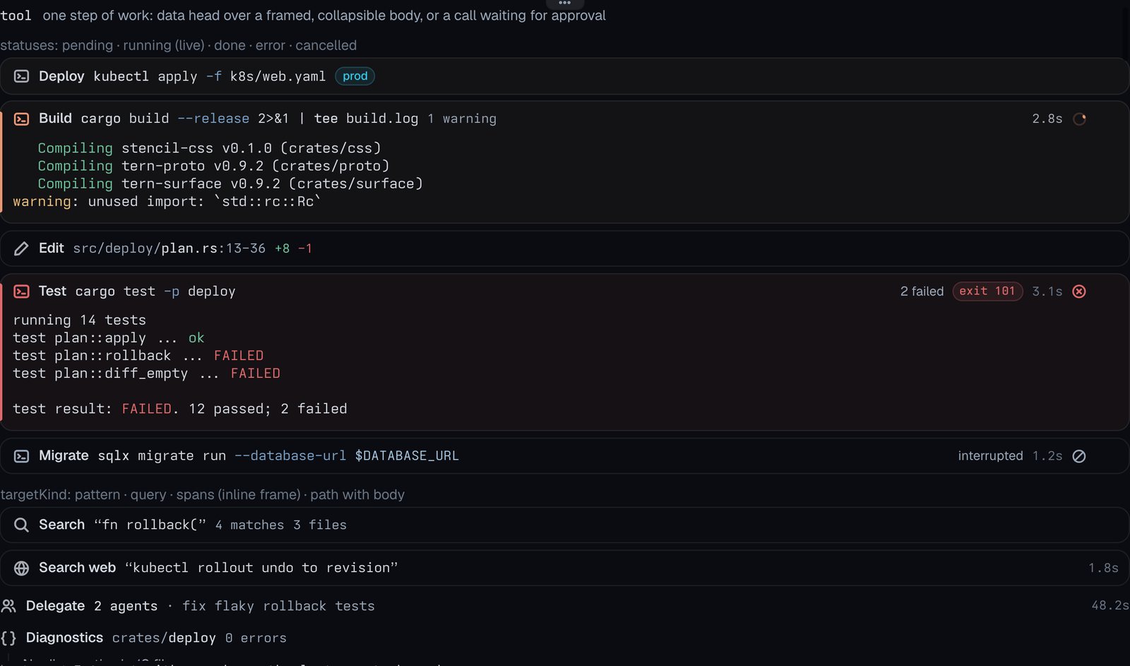
tool
One step of work: data head over a framed, collapsible body, or a call waiting for approval.
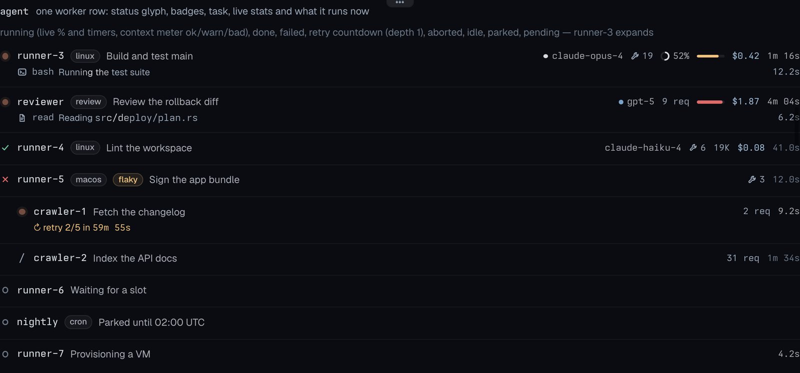
agent
One worker row: status glyph, badges, task, live stats and what it runs now.
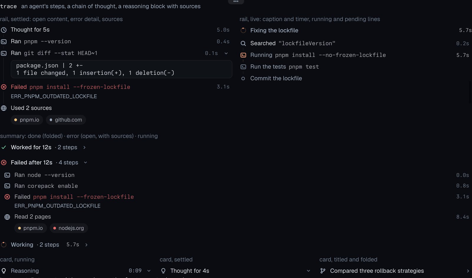
trace
An agent’s steps, a chain of thought, a reasoning block with sources.
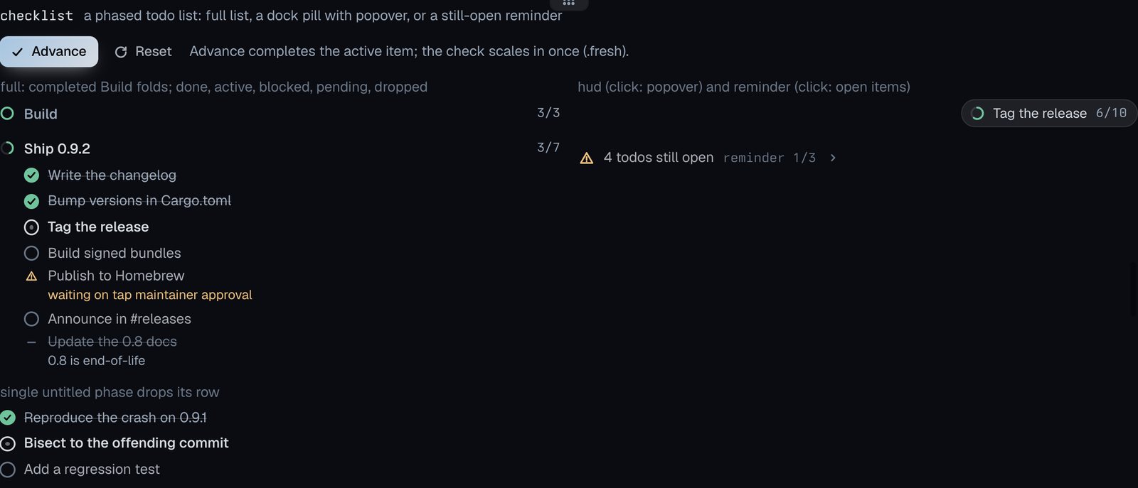
checklist
A phased todo list: full list, a dock pill with popover, or a still-open reminder.
message
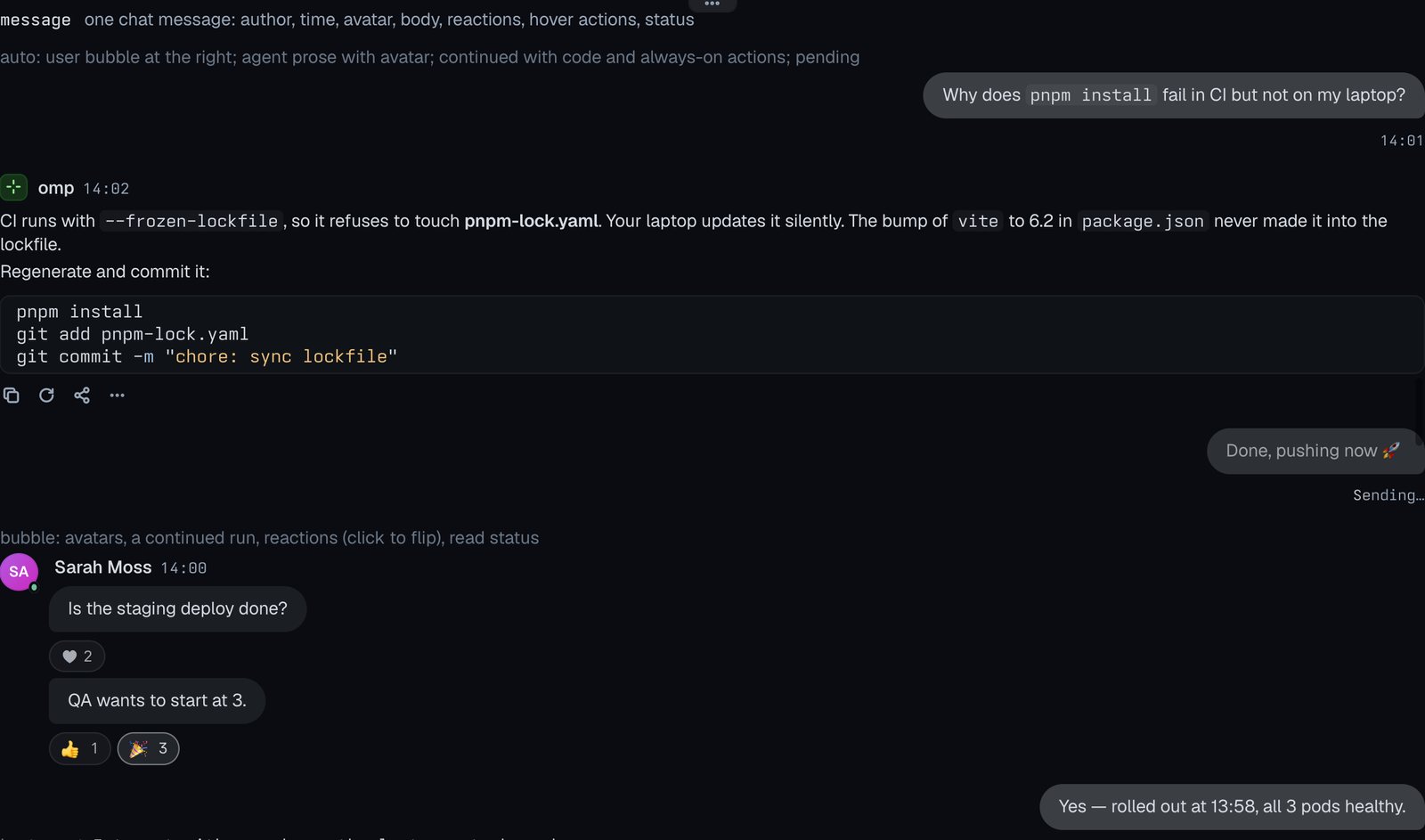
One chat message: author, time, avatar, body, reactions, hover actions, status.
suggestions
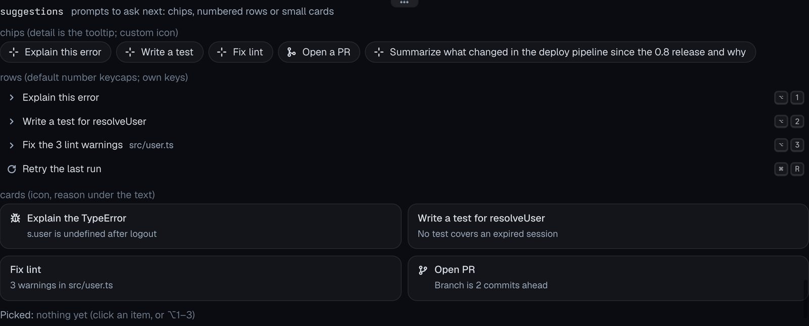
Prompts to ask next: chips, numbered rows or small cards.
questions
A questionnaire: steps, inline chips or a folding list, with answers, Next/Back/Skip/Submit and Other fields all wired.
stacktrace
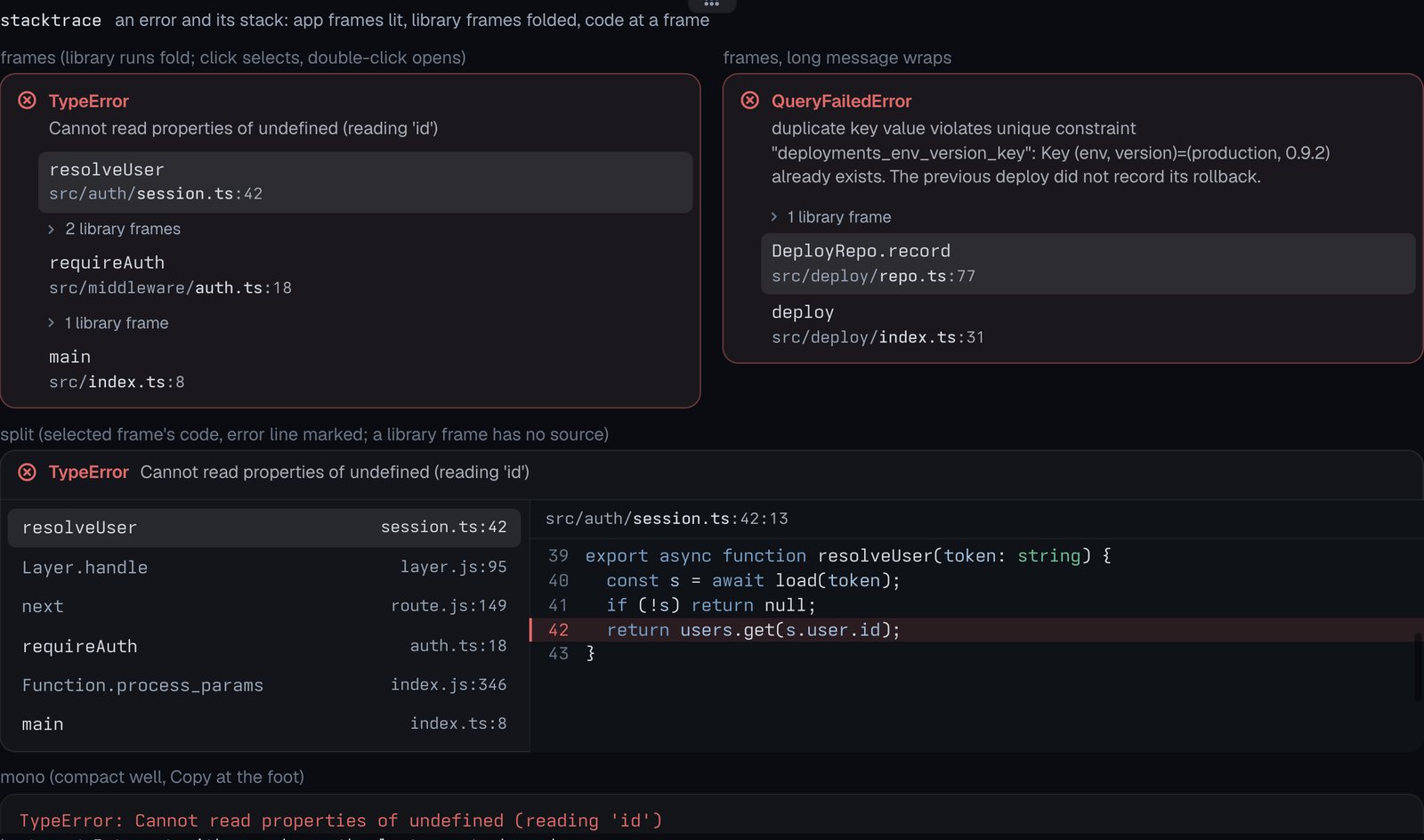
An error and its stack: app frames lit, library frames folded, code at a frame.
block
Tern’s own command-lens block around a lens view (Tern builds it; a plugin block can only draw a copy).
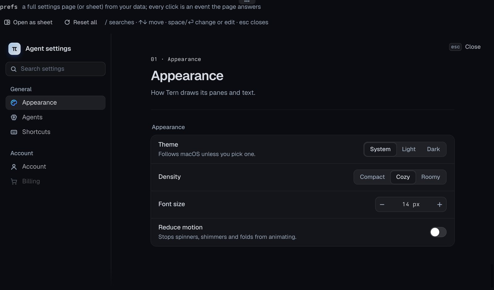
prefs
A full settings page (or sheet) from your data; every click is an event the page answers.
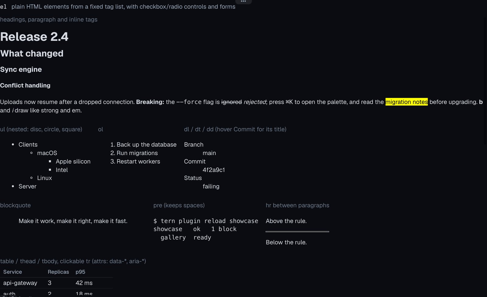
HTML elements
Docs: HTML elements
el
Plain HTML elements from a fixed tag list, with checkbox/radio controls and forms.
Try it
The gist has everything, including the six pictures the image, media and carousel demos load: gist.github.com/lfsmoura/0f305b68c6803d1b34e98db07b62f414. If you are building a Tern plugin, I found it easier to pick a kind by opening this block next to the design guide than by reading the props tables.